PLUGO E-COMMERCE PLATFORM
As an online business owner who sells goods on multiple marketplaces, I was interested by how Plugo serves as a single platform where I can manage all that. With the perspective of a user and a designer, I wanted to propose solutions to improve Plugo on both UX and business fronts.
After exploring Plugo’s app, I created a journey map from the perspective of a user who previously managed online shops on Tokopedia and Shopee separately.
For my investigation, I focused on Plugo’s mobile app, following a mobile-first approach, to prioritize addressing core issues.
Upon downloading the app, I pleased by the fast onboarding process. The first thing I wanted to do was add products to my shop. However, a UX issue I found was that the “Import from Shopee” feature doesn’t work. Clicking “Connect Marketplace account” navigates to the home page.
How might I make the process of adding a product manually faster and more enjoyable?
Solutions :
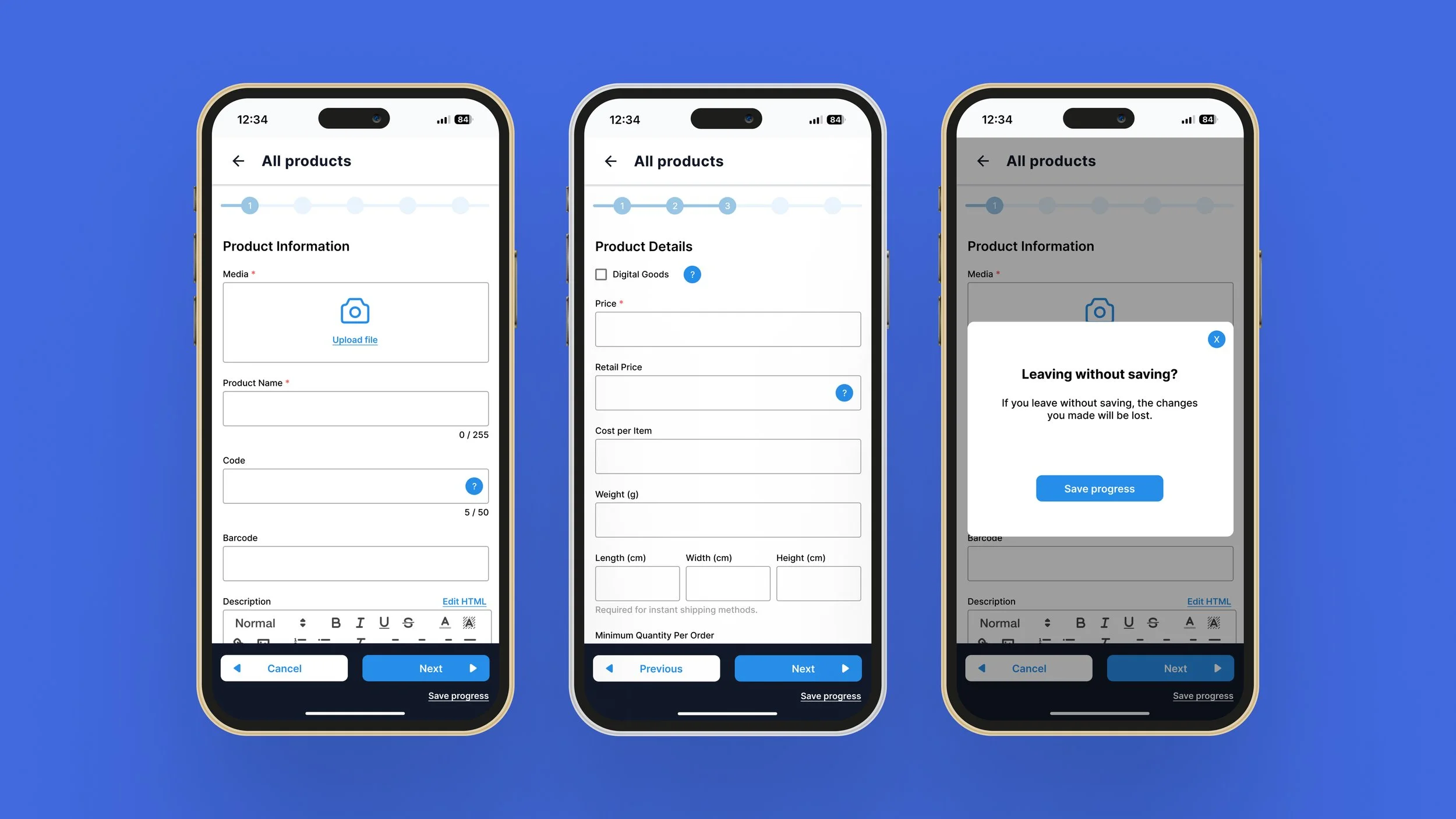
Break up the process to add a product into smaller steps.
Modify the microcopy so that the meaning of “Save” is clearly understood.
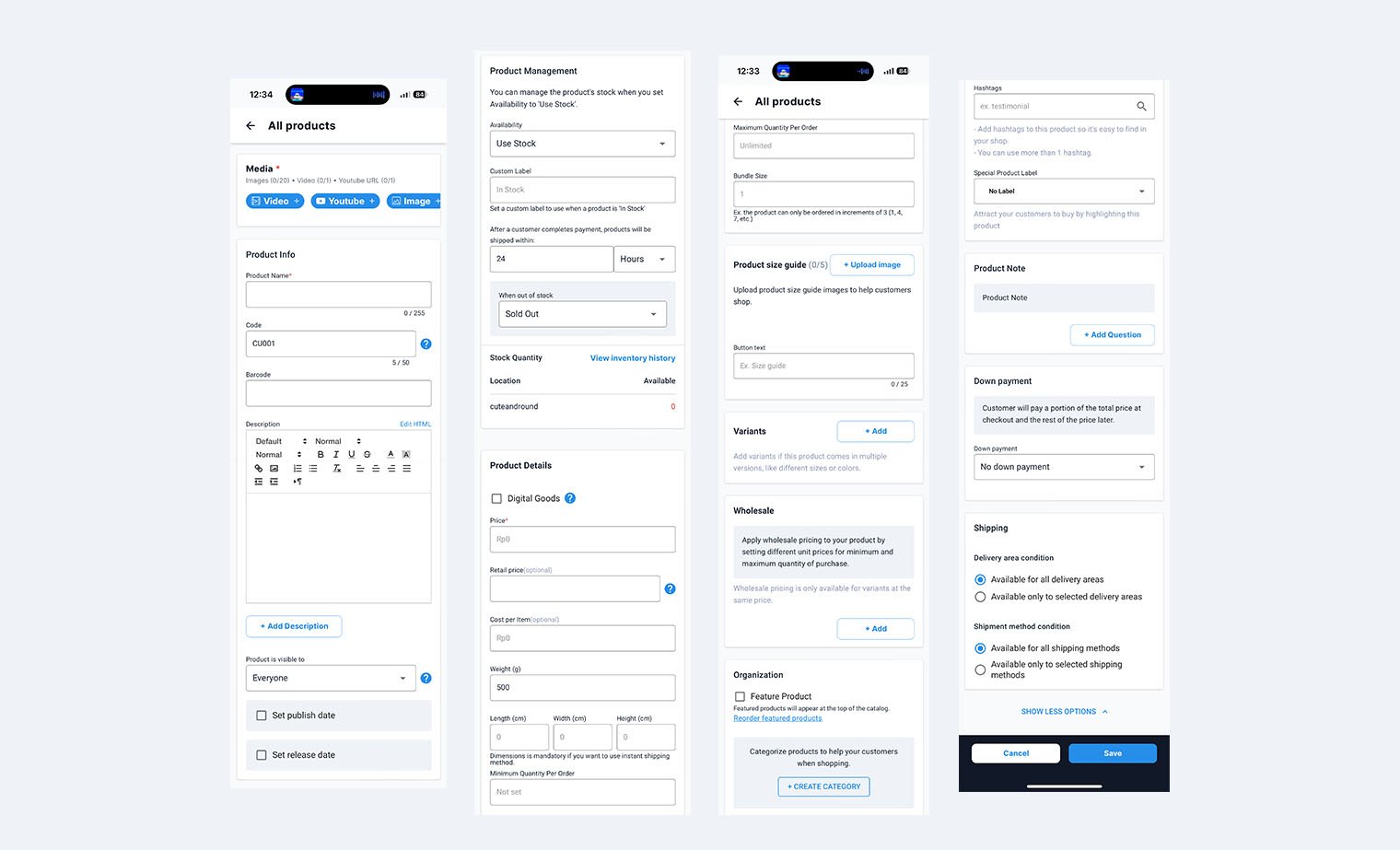
I had no choice but to add a product manually. On the right, I have broken up the process to add a product into 4 sections, but in reality, it took me 9 scrolls to see the the entire page.
Problems :
I couldn’t fill in all details in one go. It took too long.
“Save” does not save progress - it really means “Upload product”.
On the left, I designed screens that made uploading a product into a 5-step process. Users are able to save their progress so that they don’t have to re-enter data if they don’t have the time to finish filling the fields in one go.
How the solution benefits users :
Reduces user frustration from filling out a long form, thus they will be more satisfied with using the platform
Prevents task abandonment. We want people to upload products onto Plugo, but they might give up halfway if they realize it takes them long to do so.
I sketched concepts to visually express my thoughts. Then, I used Figma to develop wireframes, going straight into high-fidelity because Plugo already has their own branding and visual design elements.
Thus far, although I liked the use of blues to denote trustworthiness and the use of charming illustrations, the interface can be simplified to draw emphasis on key information. I started investigating their information architecture to determine how intuitive I, as a new user, would find it.
I draw out their site map so I could visually see where each feature belonged on the app’s infrastructure. This helped me see redundant features and note technical issues. Resolving them would improve Plugo’s chances of meeting business objectives, such as getting users to upgrade to paid accounts.
Why this matters :
It can be confusing for users to see the same feature presented differently each time
I am unable to perform any task on the Orders page and wonder if it is necessary to have.
The difference between “Create order on your shop” and “Create new order” is unclear.
How might I streamline the platform to reduce users’ cognitive load?
Solutions :
Remove redundant features
Rearrange content to match users’ mental models
Establish clear visual hierarchy by reducing visual clutter. Keeping only those with a function.
I revised the sitemap based these ideas.
Problems :
Some feature appears in more than one place, but don’t really need to be shown twice.
The “Create order on your shop” button takes me to the Home page. It doesn’t work as expected.
You can only “Create new order” with an upgraded account. Thus, I can’t do anything on Orders.
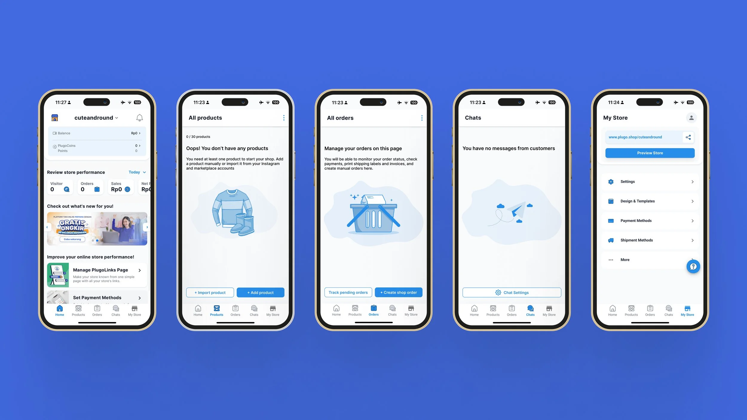
I edited Plugo’s original screens featuring the proposed solutions as seen below. Ideally, these should be tested with real users to gauge its effectiveness. Each CTA in my revised versions are placed lower on the screen than the original for easy access. I removed the customer service questions feature on the Products, Orders, and Chats pages because users should already find it straightforward to add a product or order to these pages
Before exiting the app, I played around with shopfront templates, one of Plugo’s unique offerings. I really like this feature, but the screens were still visually cluttered due to the very varied alignment of texts and buttons. This is a UI issue that when solved, could increase Plugo’s business potential, so I decided to address it.
How might I elevate the design of the Design & Templates page to make it more fun?
Users can go down a rabbit hole previewing templates, so I sketched out some low-fidelity wireframes to see if we could use other formats to make this process of scrolling and testing more fun.
I transferred the sketches onto Figma, noticing that the original Design & Template screens have categories and search filters, which I missed during the sketch phase. I implemented that back in, then I tried out one and two column paged layouts. Overall, I love what Plugo offers and can see so many ways for how their product will grow and develop with time, such as how they could make special templates only available to customers with a paid account or even sell special templates or employ a referral program for greater customer reach. I am excited for what’s next.


